
Introduction A Perfect Color Palette
Choosing the right colors can make or break the look and feel of your event. A Perfect Color Palette not only enhances décor but also sets the mood, creates cohesion, and reflects your personal style. Whether it’s a wedding, birthday, or festive celebration, understanding how to select and combine colors is essential for a visually stunning and harmonious setup. Here’s a guide to help you pick the ideal palette for your next party or event.
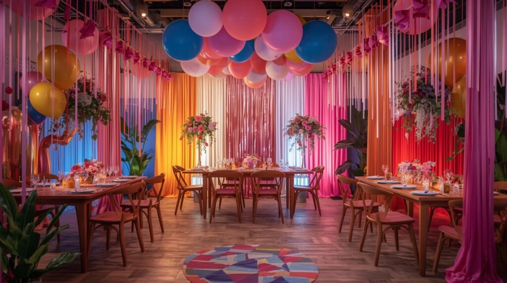
Understanding the Mood with a Perfect Color Palette
Colors evoke emotions and influence the atmosphere of your event. Warm tones like reds, oranges, and golds create energy, excitement, and a cozy vibe. Cool tones like blues, greens, and purples bring calm, elegance, and relaxation. When selecting your Perfect Color Palette, consider the mood you want your guests to experience. Harmonizing your colors with the event’s theme ensures a seamless and immersive atmosphere.
Complementary and Contrasting Colors for Balance
A balanced palette often uses complementary or contrasting colors to create visual interest. Complementary colors, like red and green or blue and orange, bring a vibrant and dynamic feel. Contrasting shades, such as soft pastels with bold neutrals, add depth without overwhelming the décor. Knowing which colors enhance each other allows your design to feel intentional and cohesive, making your space look thoughtfully curated.
Consider the Venue and Lighting
The environment plays a big role in how colors appear. Natural light can brighten shades, while dim lighting can make dark tones feel heavier. Examine the venue’s walls, flooring, and existing décor before finalizing your Perfect Color Palette. Matching or complementing the surroundings ensures your decorations stand out while blending harmoniously with the space, creating a polished and professional look.
Incorporate Textures and Accents
Colors aren’t just about paint or fabric — textures can enhance the palette. Metallic accents, glitter, or layered fabrics can add depth and richness to your scheme. For example, pairing matte linens with shiny gold accessories or soft florals with deep velvet drapes creates a sophisticated interplay of textures. Thoughtful use of textures ensures your palette feels multidimensional and visually appealing.
Test Before You Commit
Before purchasing decorations or linens, test your color combinations. Create mood boards, use digital palettes, or even lay out samples in the venue. Seeing your Perfect Color Palette in context helps you visualize the final look and avoid clashing shades. Testing also allows you to adjust proportions, ensuring that no color overpowers the others and the overall aesthetic remains balanced.
Conclusion
Selecting the Perfect Color Palette is both an art and a strategy. By considering mood, complementary colors, venue context, textures, and testing, you can create an event space that feels cohesive, vibrant, and memorable. The right colors set the tone, elevate your décor, and leave a lasting impression on your guests. With careful planning and creativity, your celebration will shine through every hue and detail.